

Older film posters typically have quite bold primary colours and the main character's name is featured in a large type, sometimes even larger than the film title because this is what is being promoted. (DR.NO poster is an example of this).
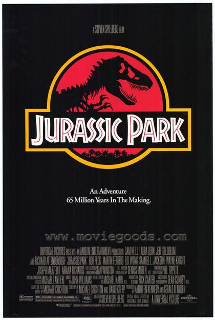
Other posters do not need a great deal of advertisement, actor/character profiling or promotion, or even much indication of plotline. (JURASSIC PARK).
Some posters have a very artistic feel (PERFUME) and feature more editing than other film posters.


My favourite film posters are those made for Totoro and Harry Potter. I particularly love this poster for My Neighbour Totoro because of the colour scheme and its innovativeness.
Harry Potter is my all-time-favourite film franchise and so I love the way that each poster gives a feel of the magic within and the plotline is suggested, along with the characters. I also favour the way that they clearly follow on from one another; i.e. the posters don't radically change in format, style or design and so you can witness the growth of the characters and plot.
I'm currently undecided on what design I will choose for my own short film poster, I think I will take inspirations from both Totoro and The Muppets.
No comments:
Post a Comment