
Showing posts with label planning. Show all posts
Showing posts with label planning. Show all posts
Friday, 12 April 2013

Thursday, 28 February 2013
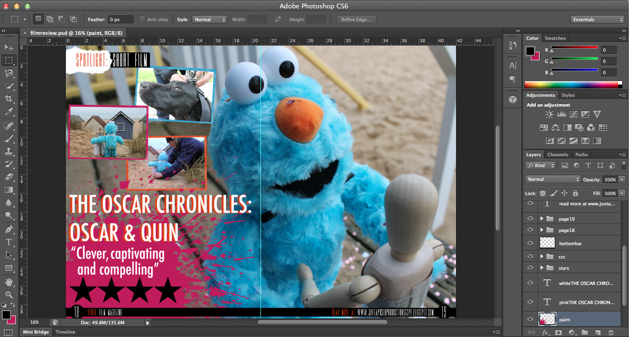
finished film review (double page spread)

When creating my review, I found that a number of people asked me why I rated my film as '4 stars', not because they thought it was too high but because they thought it should be rated '5 stars'. The reasoning behind this was because I didn't want to come across as pretentious and also, '5 star' ratings are fairly 'rare' so to speak and for a film to be of such a good quality, I feel as though it should be perfect.
finished dvd cover


dvd cover DATED24THFEBRUARY
A few weeks
ago, I decided to send off my ancillary tasks and DVD cover to a professional
printing firm in order to gain multiple hard-copies as this would be the case
for real media texts. The three pieces arrived quickly and I was really happy
with the quality, aside from my film poster being slightly under exposed. I was
incredibly impressed with the quality of my review and DVD cover J yay.
When designing my DVD cover, I
found that the most difficult part was finding images that I hadn’t already
used for my ancillary tasks. This was difficult because being a short film,
there weren’t many production photos or storylines that I could exploit.
I researched into a lot of DVD
covers to find what elements were the most successful, examples that I looked
at were the Toy Story trilogy, a number of Tim Burton films and other age
appropriate films of similar genres.
I decided to include a trio of
images and borders that I also went on to use in my film review, because the
colours form a good colour scheme for my film. J
Certain factors that I spent a
long time on were the duplication of sand, the font of the text on the back and text itself. I deliberated for a long time about the font because I wasn't particularly happy with it yet I discovered that the font used is commonly used on the back of DVD covers; this was also the case with my film review, however, upon receiving my hard-copies, I love the way that they look!
dvd design DATED 30THJANUARY
Regarding the design of my DVD cover, obviously it won't be a massively in-depth and heavily designed product because there is no budget for my film and it isn't a large scale film. Having said this however, I am going to design the product to the best of my ability to demonstrate the skills that I have learnt and acquired over the last two years. I am currently undecided on what image I would like on the cover and whether it will be a 'screenshot' (still image from my stop motion) or an external image taken during post-production. On the back of my cover I would like some kind of tagline (similar to the ones used in the images that I have attached in the blog posts below) and then to have a blurb fitted around an image. Below the blurb I intend to have three images from my film in framed boxes with the outer colour being the orange, blue and pink that I have used in my film title.


new idea DATED 29THJANUARY
Seeing as I am very interested in the post-production side of making a film and particularly the aspects of media production involving design, I came up with the idea of designing a DVD cover for my short film.
When researching the designs for films similar to my age range and genre, these were my favourite designs:


When researching the designs for films similar to my age range and genre, these were my favourite designs:


is oscar going further?
When creating the name for my film, I wanted to choose something that meant that there was a possibility to have more films in the future. Rather than just having 'Oscar & Quin' because I feel like having 'The Oscar Chronicles' adds depth and also the audience thinks, "Ooo, will there be a sequel/prequel?!" Or I hope they will ask that question anyway. :)
Creating a storyline which could be followed was a very important factor for me because I really feel like I believe in my characters and because I designed and created the puppet for Oscar myself, with help, I feel like I want to 'exploit' it/him as much as possible, so to speak.
In the summer of this year, I will be travelling to Costa Rica for a month and my intention is to take Oscar and Quin with me to either capture footage of them together, or Oscar prior to meeting her and how he comes to live in Norfolk, England. :)


Creating a storyline which could be followed was a very important factor for me because I really feel like I believe in my characters and because I designed and created the puppet for Oscar myself, with help, I feel like I want to 'exploit' it/him as much as possible, so to speak.
In the summer of this year, I will be travelling to Costa Rica for a month and my intention is to take Oscar and Quin with me to either capture footage of them together, or Oscar prior to meeting her and how he comes to live in Norfolk, England. :)


Wednesday, 27 February 2013
designing a film magazine insert
Prior to designing, writing and creating my film magazine review, I researched into existing film magazines and the kind of articles that they include.
- Empire Magazine is a British film magazine published on a monthly basis by Bauer Consumer Mediam, first published in July 1989. It is the biggest selling film magazine in Britain and is also sold in America, Australia, Turkey, Russia and Portugal. In terms of coverage and approach, Empire is very popular and takes on a more 'irreverent' and less 'serious' approachre, like Sight & Sound. Empire caters for a wide audience as it reviews not only mainstream films, but also arthouse.
- Similar to Empire, Sight & Sound is published on a monthly basis in Britain by the British Film Institute (BFI). It was initially published quarterly when it began in 1932, until the early 1990s when it merged with the Monthly Film Bulletin, another BFI publication. Sight & Sound reviews all films released during the month - both arthouse and mainstrean feature films.
- Total Film is British film magazine published by Future Publishing every four weeks, 13 times a year. Its original launch was in 1997 and offers cinema, DVD and Blu-ray news, reviews and features. 'Each month, Total Film provides a range of features, from spotlight interviews with actors and directors, to making of and on-set pieces for new and future releases. Each issue always includes the Total Film Interview, which is a six-page in-depth chat with an actor or director, along with a critique of their body of work.'
Sunday, 24 February 2013
magazines
 |
| On a magazine hype... |


Over the past few months, I've been collating Empire and Total Film magazines, not only to fuel my new-found obsession but also to gain a wide and varying understanding of the different styles adopted for writing and designing film reviews. Whilst trawling through the magazines numerous times and re-reading articles, I found a number of articles/reviews/designs which I particularly liked from different aspects. The Skyfall article from the Summer 2012 issue of Total Film features text laid on the right-hand page, of the double page spread, on top of an image of Daniel Craig as James Bond and his signature Aston Martin DB5 car. I really like the way that articles look when the text is placed directly on top of a background image rather than on a plain white background/border. This was the first inspiration for my magazine. :)
The Empire review on Wreck-It-Ralph featured a rather 'kooky' section which said things which referred to video games and so I drew inspiration from this when I designe my film review 'The Oscar Chronicles: Oscar & Quin'.
Frankenweenie and Paranorman were also featured alongside each other in comparing the makings of the films, I really like the production photos and so I decided to include photos from on set rather than images just from the film.


Wednesday, 13 February 2013
Friday, 18 January 2013


Monday, 14 January 2013
Poster design
CHOSEN FILM POSTER IMAGE...

An element that encouraged and pushed me in the direction of a 'silent' film was the inspiration of Snoopy, a fictional character from the comic strip Peanuts, created by Charles M. Schulz. For the first two years of his existence, Snoopy was a silent character until on the 27th May 1952, for the first time, he verbalised his thoughts to the reader in a thought balloon. To begin with, he was a normal dog, only thinking in simple one-word phrases, e.g. "FOOD!", but as the comic strip continued, he became increasinly more articulate. The comic strips and television specials formed a considerable chunk of my childhood and it was this that influenced my decision to remain a 'silent' film. I also didn't want to detract from the themes and meanings of my films by layering on top of the footage, an unrealistic and ill-fitting dialogue.
The hardest decision I've actually had to make, regarding my film poster, is deciding on which fonts I will use for my film poster for both the title and credits. Adobe didn't really have any fonts which I would consider to use and so I have been researching into which fonts fit my film best and which are the easiest for the eye to read. Colours are also very important, I've concluded that the title either has to stand out from the rest of the poster, or to fit with a common colour scheme from my short film.
Monday, 7 January 2013
Shots

WS (Wide Shot) - The subject takes up the full frame, or at least as much as comfortably possible.
i.e. long shot, full shot
MS (Mid Shot) - Shows some part of the subject in more detail while still giving an impression of the whole subject
MCU (Medium Close Up) - Half way between a MS and a CU
CU (Close Up) - A certain feature or part of the subject takes up the whole frame
ECU (Extreme Close Up) - The ECU gets right in and shows extreme detail
Cut-In - Shows some (other) part of the subject in detail
Cut-Away - A shot of something other than the subjectTwo-Shot - A shot of two people, framed similarly to a mid shot
Over-The-Shoulder Shot - Looking from behind a person at the subject
Point-of-View Shot - Shows a view from the subject's perspective
Weather Shot - The subject is the weather. Can be used for other purposes, i.e. background for graphics
Thursday, 3 January 2013
guess who got married today?!
Today I ventured to the beach at Wells-next-the-Sea with my mum who was going to help me with filming and moving the characters into position for both the video footage and stop motion images. The day was perfect because it wasn't overly sunny, absolutely no rain and the sky was blue. Yay! A lot happened, and surprisingly, a lot actually changed!
 |
| Suited and booted, Oscar is ready to go! |
 |
| Pretty pretty location, perfecttttt. |
 |
| Chosen beach hut, 190, WEDDING CEREMONY! |
 |
| How cute is this couple?! (No? Okay, well, I think they're cute). |
|
| One of these images is going to be used for my poster, but I have no idea which, DILEMMAAAAA. |
 |
| Helloooooo team! |
 |
| ARE YOU READY FOR A PLOT TWIST?! *SHOCKED FACE* |
 |
| AAAAAAAAND, READY, STEADY, CUE PLOT TWIST. DUN DUN DDDDDUUUUUUUUUNNNNNN. |
Wednesday, 2 January 2013
mixing it uppppp
Over the past week I have been thinking about how I can 'mix up' my short film to make it a bit more exciting and so I have decided to take a trip to the North Norfolk coast, beach here we come! I am thinking of filming the wedding scene, and possibly others, with the location of a beach hut. Not only do I think it makes it a lot cuter, but also a lot more exciting than just filming in my garden.
I'll be visiting a number of beaches, both pebble and sand, in order to capture the perfect footage for what I want. My aim is to get as much footage as possible which I can then sort through to choose the best scenes.
I found a particularly inspiring blog post which included images of the beach at Wells-next-the-Sea. The images are great and I would love to be able to film around beach huts and docked boats.


I'll be visiting a number of beaches, both pebble and sand, in order to capture the perfect footage for what I want. My aim is to get as much footage as possible which I can then sort through to choose the best scenes.
I found a particularly inspiring blog post which included images of the beach at Wells-next-the-Sea. The images are great and I would love to be able to film around beach huts and docked boats.


Monday, 31 December 2012


Sunday, 23 December 2012
Poster research time
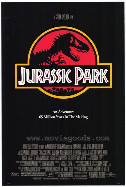


Older film posters typically have quite bold primary colours and the main character's name is featured in a large type, sometimes even larger than the film title because this is what is being promoted. (DR.NO poster is an example of this).
Other posters do not need a great deal of advertisement, actor/character profiling or promotion, or even much indication of plotline. (JURASSIC PARK).
Some posters have a very artistic feel (PERFUME) and feature more editing than other film posters.


My favourite film posters are those made for Totoro and Harry Potter. I particularly love this poster for My Neighbour Totoro because of the colour scheme and its innovativeness.
Harry Potter is my all-time-favourite film franchise and so I love the way that each poster gives a feel of the magic within and the plotline is suggested, along with the characters. I also favour the way that they clearly follow on from one another; i.e. the posters don't radically change in format, style or design and so you can witness the growth of the characters and plot.
I'm currently undecided on what design I will choose for my own short film poster, I think I will take inspirations from both Totoro and The Muppets.
Wednesday, 19 December 2012

Title Sequence Image 2

2nd image....this was surprisingly harder to complete than the first because I didn't think to do all of the images at the same time and so I lost the colours. This meant that I had to find as similar match as possible, using the eyedropper tool worked enough however, because I had used varying opacities, the colours weren't true matches. But, they work nonetheless. Particularly for this one in which the shed can be a darker colour because of the rain :)
Subscribe to:
Posts (Atom)