So I've recently been having a play around with different poster ideas, mainly because I'm not actually too sure on what kind of feel I want my poster to convey to an audience. When I first started researching posters (see http://juxtaposedproductionsg324.blogspot.co.uk/2012/07/film-posters.html), I realised how much I actually prefer teaser posters to the official film posters themselves; I think this is due to the lack of creditations on them and either the mystery of what a film could be about, or if it is a well-known film, then the excitement of the actors/actresses/plotline. My favourite posters to study and analyse have been for The Dark Knight, Totoro and Tinker, Tailor, Soldier, Spy. In particular, my favourite posters have been quite 'dark' and mysterious. For this reason, when I think of designing my own poster, my instinct is to make one inspired by this, however......Sadly, my film doesn't reaaaaally have too much of a dark element because the film takes place AFTER a darker element occurs (Oscar living alone). So, I'm actually quite stuck on poster ideas....Another problem I keep encountering is the choice of font. I'm quite a perfectionist and so even if I had an amazing poster design, if the font wasn't to the same standard, I wouldn't be happy. So it's all quite a dilemma! I can't be dealing with this kind of stress prior to the deadline. HELP.
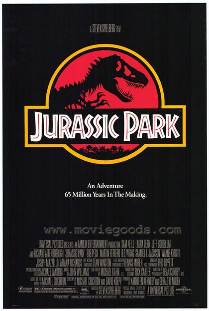
Film posters all have a very different appearance and reception based upon the genre and target audience of the film. Older film posters typically have quite bold primary colours and the main character's name is featured in a large type, sometimes even larger than the film title because this is what is being promoted. (DR.NO poster is an example of this). Other posters do not need a great deal of advertisement, actor/character profiling or promotion, or even much indication of plotline. (JURASSIC PARK). Some posters have a very artistic feel (PERFUME) and feature more editing than other film posters.
My favourite film posters are those made for Totoro and Harry Potter. I particularly love this poster for My Neighbour Totoro because of the colour scheme and its innovativeness. Harry Potter is my all-time-favourite film franchise and so I love the way that each poster gives a feel of the magic within and the plotline is suggested, along with the characters. I also favour the way that they clearly follow on from one another; i.e. the posters don't radically change in format, style or design and so you can witness the growth of the characters and plot. I'm currently undecided on what design I will choose for my own short film poster, I think I will take inspirations from both Totoro and The Muppets.
2nd image....this was surprisingly harder to complete than the first because I didn't think to do all of the images at the same time and so I lost the colours. This meant that I had to find as similar match as possible, using the eyedropper tool worked enough however, because I had used varying opacities, the colours weren't true matches. But, they work nonetheless. Particularly for this one in which the shed can be a darker colour because of the rain :)
I recently reached the decision to create an image-based title sequence rather than just laying text titles on top of the footage or having a blank screen. The image above was a picture that I drew on to lined notepad paper and then scanned into a computer. I then used Adobe Photoshop CS4 and CS6 to use fairly translucent paint tools on top. I am really pleased with the outcome of despite it taking a fair while to complete because only one layer of colour could be used otherwise it would layer darker and this meant that I had to do lots of erasing too!
Over the past week I have been set on re-creating/designing my production company ident because I wasn't happy with the one that I previously created at AS Level. I watched a few YouTube After Effects tutorials to learn some new skills and to come up with new ideas that I could use in my new ident. In order to achieve this ident, these are the processes that I carried out:
creating fractal energy
making the fractal type dynamic
playing with the contrast
adding a cc vector blur
adding colour correction curves
creating text in the century gothic font
I really like this company ident because it is an enhanced extension of my previous one yet is completely different. Although, I am going to try and not look at it too much during production work because I know if I do, then I will probably start to dislike it. But for now, I REALLY LIKE IT, YAY.


.JPG)
.JPG)