Thursday 28 February 2013

FINAL FILM

Here is my final film, I released it on YouTube on February 3rd and since then it has received 186 views to date, a number of comments and 6 likes. I am incredibly happy with the response because it included a wide range of ages and a lot of people had something positive or constructive to say. :)
Facebook comments: 
such a good idea!
that's awesome!
too cute!! :D
this is great - all the hours have paid off!!!!
very well done! does he die at the end? lovely to see your mum, brother and house!
what can i say?!!! that is excellent, well done.
21 likes

YouTube comments:
very good, how long did it take to get the stop motion bit right?
wow! That must have taken hours of work and what a great end result! Your first attempt at film making was a success. The sound track was beautiful and I really enjoyed watching it.
THATS SOO COOOOL!
6 likes

updated film poster - complete


finished film review (double page spread)


Here is my finished film review, I am really pleased with it! I made a number of changes during the production process because I found that having the background image fully visible made it difficult to both view the text and also to find a text colour that was visible on all areas. For this reason, I changed the hue and exposure to tone down the image and to give it more of a washed-out effect. This meant that I could use simple black text on top (I actually layered it twice to make it more visible) and the orange type was also clear. I decided to put my blog site on the bottom trimming because I found that a lot of magazines either had links to the magazine's site or the film's individual site. It also provides a nice 'link' (excuse the pun) to my production company - Juxtaposed Productions.
When creating my review, I found that a number of people asked me why I rated my film as '4 stars', not because they thought it was too high but because they thought it should be rated '5 stars'. The reasoning behind this was because I didn't want to come across as pretentious and also, '5 star' ratings are fairly 'rare' so to speak and for a film to be of such a good quality, I feel as though it should be perfect. 

finished dvd cover

Here is the DVD cover for my film, I am incredibly pleased with it, I decided to keep it fairly 'simple' because obviously my film is a short - the plotline isn't thaaaat extravagant and short films typically don't have DVDs unless they are made by Pixar etc.


dvd cover DATED24THFEBRUARY


A few weeks ago, I decided to send off my ancillary tasks and DVD cover to a professional printing firm in order to gain multiple hard-copies as this would be the case for real media texts. The three pieces arrived quickly and I was really happy with the quality, aside from my film poster being slightly under exposed. I was incredibly impressed with the quality of my review and DVD cover J yay.
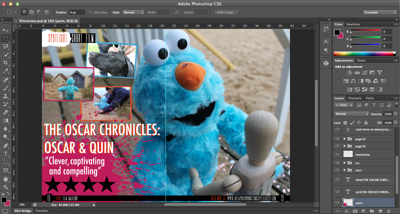
When designing my DVD cover, I found that the most difficult part was finding images that I hadn’t already used for my ancillary tasks. This was difficult because being a short film, there weren’t many production photos or storylines that I could exploit.
I researched into a lot of DVD covers to find what elements were the most successful, examples that I looked at were the Toy Story trilogy, a number of Tim Burton films and other age appropriate films of similar genres.
I decided to include a trio of images and borders that I also went on to use in my film review, because the colours form a good colour scheme for my film. J
Certain factors that I spent a long time on were the duplication of sand, the font of the text on the back and text itself. I deliberated for a long time about the font because I wasn't particularly happy with it yet I discovered that the font used is commonly used on the back of DVD covers; this was also the case with my film review, however, upon receiving my hard-copies, I love the way that they look! 

dvd design DATED 30THJANUARY

Regarding the design of my DVD cover, obviously it won't be a massively in-depth and heavily designed product because there is no budget for my film and it isn't a large scale film. Having said this however, I am going to design the product to the best of my ability to demonstrate the skills that I have learnt and acquired over the last two years. I am currently undecided on what image I would like on the cover and whether it will be a 'screenshot' (still image from my stop motion) or an external image taken during post-production. On the back of my cover I would like some kind of tagline (similar to the ones used in the images that I have attached in the blog posts below) and then to have a blurb fitted around an image. Below the blurb I intend to have three images from my film in framed boxes with the outer colour being the orange, blue and pink that I have used in my film title.


One problem with my film is the characters are not voiced and so there aren't any actors. I have however come across a poster for Rise of the Guardians which has the characters' names written across the top, rather than the actors. (Could be a solution) i.e. the sandman, tooth fairy, santa claus, jack frost, easter bunny.

new idea DATED 29THJANUARY

Seeing as I am very interested in the post-production side of making a film and particularly the aspects of media production involving design, I came up with the idea of designing a DVD cover for my short film. 
When researching the designs for films similar to my age range and genre, these were my favourite designs:

is oscar going further?

When creating the name for my film, I wanted to choose something that meant that there was a possibility to have more films in the future. Rather than just having 'Oscar & Quin' because I feel like having 'The Oscar Chronicles' adds depth and also the audience thinks, "Ooo, will there be a sequel/prequel?!" Or I hope they will ask that question anyway. :)

Creating a storyline which could be followed was a very important factor for me because I really feel like I believe in my characters and because I designed and created the puppet for Oscar myself, with help, I feel like I want to 'exploit' it/him as much as possible, so to speak.

In the summer of this year, I will be travelling to Costa Rica for a month and my intention is to take Oscar and Quin with me to either capture footage of them together, or Oscar prior to meeting her and how he comes to live in Norfolk, England. :)


first draft of film review

As our famous old friend Shakespeare wrote in ‘A Midsummer Nights Dream’ way back in 1598: “Ay me! for aught that I could ever read, Could ever hear by tale or history, The course of true love never did run smooth; But either it was different in blood—“, the challenges new lovers face are as common today as ever before. This is certainly the case for Oscar and Quin, who feature in The Oscar Chronicles, created by first-time British director, Nicole O’Malley.
Oscar & Quin, a four minute stop-motion animated short film follows the story of Oscar, a furry blue character, destined for a gloomy life in a landfill site. Within seconds of the film beginning, we’re thrown into the turmoil of discarding outgrown toys and thrown in the literal sense into the rubbish bin. All is not lost when Oscar finds true love with Quin, a broken mannequin. Together they defy the odds and prove that hope is not lost but when faced with a life-threatening situation, their future becomes compromised.
Created on a shoestring budget, O’Malley describes her reasoning behind combining stop-motion and live action in The Oscar Chronicles “when intertwined with live action, stop-motion brings a timeless quality in a way that no other medium provides”.  
There’s something gratifying about seeing the animation process in action, the giving of life to inanimate objects, be they hand-drawn images, computer-generated models or articulated puppets. But there’s something particularly special about stop-motion animation. It’s not the process itself, which is painstakingly laborious, but what goes on behind the scenes.
Set in a rural Norfolk village in contemporary England, it’s a quirky tale of optimism and romance that compels and captivates the audience into the first instalment of The Oscar Chronicles.

RELEASED February 28
DIRECTOR Nicole O’Malley
RUNNING TIME 4 mins.

Wednesday 27 February 2013

designing a film magazine insert

Prior to designing, writing and creating my film magazine review, I researched into existing film magazines and the kind of articles that they include.
  • Empire Magazine is a British film magazine published on a monthly basis by Bauer Consumer Mediam, first published in July 1989. It is the biggest selling film magazine in Britain and is also sold in America, Australia, Turkey, Russia and Portugal. In terms of coverage and approach, Empire is very popular and takes on a more 'irreverent' and less 'serious' approachre, like Sight & Sound. Empire caters for a wide audience as it reviews not only mainstream films, but also arthouse.
  • Similar to Empire, Sight & Sound is published on a monthly basis in Britain by the British Film Institute (BFI). It was initially published quarterly when it began in 1932, until the early 1990s when it merged with the Monthly Film Bulletin, another BFI publication. Sight & Sound reviews all films released during the month - both arthouse and mainstrean feature films.
  • Total Film is British film magazine published by Future Publishing every four weeks, 13 times a year. Its original launch was in 1997 and offers cinema, DVD and Blu-ray news, reviews and features. 'Each month, Total Film provides a range of features, from spotlight interviews with actors and directors, to making of and on-set pieces for new and future releases. Each issue always includes the Total Film Interview, which is a six-page in-depth chat with an actor or director, along with a critique of their body of work.'
When creating my film review, I constantly kept in the back of my mind that my film was a short and so if it were to be reviewed in a magazine then it would have to be a 'special occasion'. This was why I decided to make my insert a 'Spotlight' and so it was enabling the reader to witness, read about and potentially watch a short film. Empire Magazine don't really tend to do this kind of thing so initially this cast doubt in my mind, however, Total Film really encouraged me to do it because they often provide 'spotlight interviews' :).

Sunday 24 February 2013

magazines

On a magazine hype...

 Over the past few months, I've been collating Empire and Total Film magazines, not only to fuel my new-found obsession but also to gain a wide and varying understanding of the different styles adopted for writing and designing film reviews. Whilst trawling through the magazines numerous times and re-reading articles, I found a number of articles/reviews/designs which I particularly liked from different aspects. The Skyfall article from the Summer 2012 issue of Total Film features text laid on the right-hand page, of the double page spread, on top of an image of Daniel Craig as James Bond and his signature Aston Martin DB5 car. I really like the way that articles look when the text is placed directly on top of a background image rather than on a plain white background/border. This was the first inspiration for my magazine. :)
The Empire review on Wreck-It-Ralph featured a rather 'kooky' section which said things which referred to video games and so I drew inspiration from this when I designe my film review 'The Oscar Chronicles: Oscar & Quin'. 
Frankenweenie and Paranorman were also featured alongside each other in comparing the makings of the films, I really like the production photos and so I decided to include photos from on set rather than images just from the film.

Thursday 14 February 2013

updated poster

Upon making the initial design for my film review, I have come to think about when the release date of my short film. Originally I dated it as 'January 2013' however, my deadline for the project falls in February and I want my magazine to be in March and so I've reached the decision to change the date, otherwise the audience interprets that my film is slightly old. 

Wednesday 6 February 2013

added scene

Upon showing my film to the class, I received really helpful feedback and from this I made the enhancement of adding a flashback scene to mix up the narrative, rather than just being linear.
Rather than focusing on Oscar or Quin this time, I decided to make it more human so that the audience can have an even greater rapport with the characters, and so I filmed my brother opening a present, with Oscar inside. I filmed a variety of shots, closeup, mid-closeups, POV shots but I decided to simply use the one type of shot, rather than a mixture because I felt that within my film I had used a wide variety of shots and by using more than one for the one scene, it seemed to make it a bit disjointed. With regards to editing, I chose to add an effect that would give the clip an aged and vintage look because the rest of my film doesn't really have many effects because it is more driven by the narrative and storyline. I also sped it up slightly so that it didn't last for too long, (because my brother was a little bit slow at opening!!), and also changed the saturation/gamma.