Upon reviewing the opening of my short film, I came to realise that the changes that I made during production meant that the Photoshop images that I had created were no longer relevant and actually detracted from the effectiveness of my film. This was because the 'backstory' that I had created for Oscar no longer fitted and if anything, made the plotline less seamless and quite confusing. For this reason and because I didn't want to put my hard work to waste, I decided to draw out some new images which I hoped would be better. I thought that I would create just two images, rather than five or six, and the first I decided would show Oscar alone in the garden and then to fit with my dog Holly carrying Oscar out later in the film, my dog carrying Oscar in from outside. However, I felt that they didn't really work and I preferred my short film without them.
Regarding my film title.....
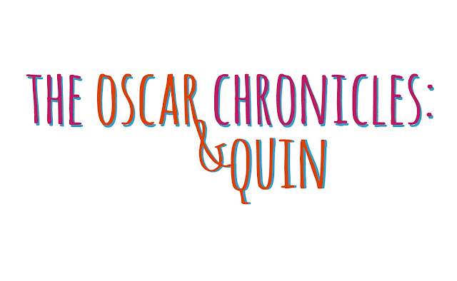
Initially, I couldn't find a font that fitted either my genre, style, theme, colour scheme, target audience or anything of that sort so I turned to finding one to download from the Internet and then I came across a font which I layered on top of each other in two colours to make it stand out. :) I chose the colours because the orange matched Oscar's nose; blue for Oscar's fur and the pink was a good contrasting colour to match with. Regarding the actual words in my title... I wanted to create a title that suggested the possibility of it becoming a series of short films following the life of Oscar. To go with this, (similar to Harry Potter and the .....) I chose 'Oscar & Quin' because it is short enough to fit with the length of the full title and it is enough detail to just suggest the characters and plot. Also considering that my film is a silent film, it works well to have the character's names in the title otherwise these would be lost and less of a connection would be made between the characters and audience.
Additional note, I really like the way the blue looks behind the title because it adds a drop shadow making it stand out more but there's actually a relevance behind the colour. (MISE EN SCENE IN ACTION...)
Snoooooooooopy. When preparing to edit my short film, I watched a few episodes of Snoopy to gain an idea of what music was used and how the lack of speech was approached. I then came across a clip on YouTube of Snoopy's wedding (which sadly goes wrong...) which was really helpful because I was worrying about what music to use and it showed me that I could just use a basic song (copyright free, of course) which fitted with my whole film, mixed up with a few others.


No comments:
Post a Comment