Showing posts with label ancillary task. Show all posts
Friday, 12 April 2013
Thursday, 28 February 2013
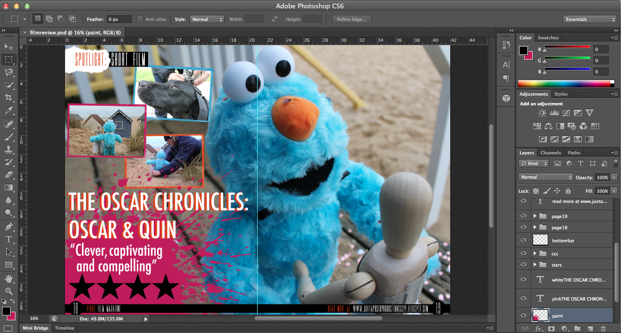
finished film review (double page spread)
When creating my review, I found that a number of people asked me why I rated my film as '4 stars', not because they thought it was too high but because they thought it should be rated '5 stars'. The reasoning behind this was because I didn't want to come across as pretentious and also, '5 star' ratings are fairly 'rare' so to speak and for a film to be of such a good quality, I feel as though it should be perfect.
Labels:
adobe,
ancillary task,
audience feedback,
evaluation,
feedback,
film,
film review,
finished production work,
idea,
magazine,
photoshop,
planning,
post-production,
production,
research,
research and planning
finished dvd cover
Here is the DVD cover for my film, I am incredibly pleased with it, I decided to keep it fairly 'simple' because obviously my film is a short - the plotline isn't thaaaat extravagant and short films typically don't have DVDs unless they are made by Pixar etc.
Labels:
adobe,
ancillary task,
company logo,
dvd case,
dvd cover,
film,
finished production work,
idea,
photoshop,
planning,
post-production,
production,
research,
research and planning,
technology
dvd cover DATED24THFEBRUARY
A few weeks
ago, I decided to send off my ancillary tasks and DVD cover to a professional
printing firm in order to gain multiple hard-copies as this would be the case
for real media texts. The three pieces arrived quickly and I was really happy
with the quality, aside from my film poster being slightly under exposed. I was
incredibly impressed with the quality of my review and DVD cover J yay.
When designing my DVD cover, I
found that the most difficult part was finding images that I hadn’t already
used for my ancillary tasks. This was difficult because being a short film,
there weren’t many production photos or storylines that I could exploit.
I researched into a lot of DVD
covers to find what elements were the most successful, examples that I looked
at were the Toy Story trilogy, a number of Tim Burton films and other age
appropriate films of similar genres.
I decided to include a trio of
images and borders that I also went on to use in my film review, because the
colours form a good colour scheme for my film. J
Certain factors that I spent a
long time on were the duplication of sand, the font of the text on the back and text itself. I deliberated for a long time about the font because I wasn't particularly happy with it yet I discovered that the font used is commonly used on the back of DVD covers; this was also the case with my film review, however, upon receiving my hard-copies, I love the way that they look!
Labels:
adobe,
ancillary task,
dvd case,
dvd cover,
evaluation,
film,
film poster,
film review,
final poster,
finished production work,
magazine,
photoshop,
planning,
post-production,
research,
research and planning
first draft of film review
As our famous
old friend Shakespeare wrote in ‘A Midsummer Nights Dream’ way back in 1598: “Ay me! for aught that I could ever read, Could
ever hear by tale or history, The course
of true love never did run smooth; But either it was different in blood—“,
the challenges new lovers face are as common today as ever before. This is
certainly the case for Oscar and Quin, who feature in The Oscar Chronicles,
created by first-time British director, Nicole O’Malley.
Oscar & Quin, a four minute stop-motion animated short
film follows the story of Oscar, a furry blue character, destined for a gloomy
life in a landfill site. Within
seconds of the film beginning, we’re thrown into the turmoil of discarding
outgrown toys and thrown in the literal sense into the rubbish bin. All is not
lost when Oscar finds true love with Quin, a broken mannequin. Together
they defy the odds and prove that hope is not lost but when faced with a
life-threatening situation, their future becomes compromised.
Created on
a shoestring budget, O’Malley describes her reasoning behind combining stop-motion
and live action in The Oscar Chronicles
“when intertwined with live action, stop-motion brings a timeless quality in a
way that no other medium provides”.
There’s something gratifying about seeing the
animation process in action, the giving of life to inanimate objects, be they
hand-drawn images, computer-generated models or articulated puppets. But
there’s something particularly special about stop-motion animation. It’s not
the process itself, which is painstakingly laborious, but what goes on behind
the scenes.
Set in a rural Norfolk village in contemporary
England, it’s a quirky tale of optimism and romance that compels and captivates
the audience into the first instalment of The Oscar Chronicles.
RELEASED
February 28
DIRECTOR Nicole
O’Malley
RUNNING TIME
4 mins.
Wednesday, 27 February 2013
designing a film magazine insert
Prior to designing, writing and creating my film magazine review, I researched into existing film magazines and the kind of articles that they include.
- Empire Magazine is a British film magazine published on a monthly basis by Bauer Consumer Mediam, first published in July 1989. It is the biggest selling film magazine in Britain and is also sold in America, Australia, Turkey, Russia and Portugal. In terms of coverage and approach, Empire is very popular and takes on a more 'irreverent' and less 'serious' approachre, like Sight & Sound. Empire caters for a wide audience as it reviews not only mainstream films, but also arthouse.
- Similar to Empire, Sight & Sound is published on a monthly basis in Britain by the British Film Institute (BFI). It was initially published quarterly when it began in 1932, until the early 1990s when it merged with the Monthly Film Bulletin, another BFI publication. Sight & Sound reviews all films released during the month - both arthouse and mainstrean feature films.
- Total Film is British film magazine published by Future Publishing every four weeks, 13 times a year. Its original launch was in 1997 and offers cinema, DVD and Blu-ray news, reviews and features. 'Each month, Total Film provides a range of features, from spotlight interviews with actors and directors, to making of and on-set pieces for new and future releases. Each issue always includes the Total Film Interview, which is a six-page in-depth chat with an actor or director, along with a critique of their body of work.'
Sunday, 24 February 2013
magazines
![]() |
| On a magazine hype... |

Over the past few months, I've been collating Empire and Total Film magazines, not only to fuel my new-found obsession but also to gain a wide and varying understanding of the different styles adopted for writing and designing film reviews. Whilst trawling through the magazines numerous times and re-reading articles, I found a number of articles/reviews/designs which I particularly liked from different aspects. The Skyfall article from the Summer 2012 issue of Total Film features text laid on the right-hand page, of the double page spread, on top of an image of Daniel Craig as James Bond and his signature Aston Martin DB5 car. I really like the way that articles look when the text is placed directly on top of a background image rather than on a plain white background/border. This was the first inspiration for my magazine. :)
The Empire review on Wreck-It-Ralph featured a rather 'kooky' section which said things which referred to video games and so I drew inspiration from this when I designe my film review 'The Oscar Chronicles: Oscar & Quin'.
Frankenweenie and Paranorman were also featured alongside each other in comparing the makings of the films, I really like the production photos and so I decided to include photos from on set rather than images just from the film.
Thursday, 14 February 2013
updated poster
Upon making the initial design for my film review, I have come to think about when the release date of my short film. Originally I dated it as 'January 2013' however, my deadline for the project falls in February and I want my magazine to be in March and so I've reached the decision to change the date, otherwise the audience interprets that my film is slightly old.
Wednesday, 13 February 2013
Friday, 18 January 2013
Monday, 14 January 2013
Poster design
CHOSEN FILM POSTER IMAGE...
Regarding my film poster design, I am choosing not to use an overly-edited or actor-driven style. Firstly, I couldn't really make it very actor-driven because of the lack of cast within my short film, being that there is actually only one human role. And I feel that using an edited image would detract from the style, genre and theme of my short film which relies on the characters to drive the plot and it is fairly simplistic, following the concept that I am not using an dialogue, only non-diagetic music and sound. An element that encouraged and pushed me in the direction of a 'silent' film was the inspiration of Snoopy, a fictional character from the comic strip Peanuts, created by Charles M. Schulz. For the first two years of his existence, Snoopy was a silent character until on the 27th May 1952, for the first time, he verbalised his thoughts to the reader in a thought balloon. To begin with, he was a normal dog, only thinking in simple one-word phrases, e.g. "FOOD!", but as the comic strip continued, he became increasinly more articulate. The comic strips and television specials formed a considerable chunk of my childhood and it was this that influenced my decision to remain a 'silent' film. I also didn't want to detract from the themes and meanings of my films by layering on top of the footage, an unrealistic and ill-fitting dialogue.
The hardest decision I've actually had to make, regarding my film poster, is deciding on which fonts I will use for my film poster for both the title and credits. Adobe didn't really have any fonts which I would consider to use and so I have been researching into which fonts fit my film best and which are the easiest for the eye to read. Colours are also very important, I've concluded that the title either has to stand out from the rest of the poster, or to fit with a common colour scheme from my short film.
Monday, 31 December 2012
Ancillary Tasks - Posters
So I've recently been having a play around with different poster ideas, mainly because I'm not actually too sure on what kind of feel I want my poster to convey to an audience.
When I first started researching posters (see http://juxtaposedproductionsg324.blogspot.co.uk/2012/07/film-posters.html), I realised how much I actually prefer teaser posters to the official film posters themselves; I think this is due to the lack of creditations on them and either the mystery of what a film could be about, or if it is a well-known film, then the excitement of the actors/actresses/plotline.
My favourite posters to study and analyse have been for The Dark Knight, Totoro and Tinker, Tailor, Soldier, Spy. In particular, my favourite posters have been quite 'dark' and mysterious. For this reason, when I think of designing my own poster, my instinct is to make one inspired by this, however......Sadly, my film doesn't reaaaaally have too much of a dark element because the film takes place AFTER a darker element occurs (Oscar living alone). So, I'm actually quite stuck on poster ideas....Another problem I keep encountering is the choice of font. I'm quite a perfectionist and so even if I had an amazing poster design, if the font wasn't to the same standard, I wouldn't be happy. So it's all quite a dilemma! I can't be dealing with this kind of stress prior to the deadline. HELP.
When I first started researching posters (see http://juxtaposedproductionsg324.blogspot.co.uk/2012/07/film-posters.html), I realised how much I actually prefer teaser posters to the official film posters themselves; I think this is due to the lack of creditations on them and either the mystery of what a film could be about, or if it is a well-known film, then the excitement of the actors/actresses/plotline.
My favourite posters to study and analyse have been for The Dark Knight, Totoro and Tinker, Tailor, Soldier, Spy. In particular, my favourite posters have been quite 'dark' and mysterious. For this reason, when I think of designing my own poster, my instinct is to make one inspired by this, however......Sadly, my film doesn't reaaaaally have too much of a dark element because the film takes place AFTER a darker element occurs (Oscar living alone). So, I'm actually quite stuck on poster ideas....Another problem I keep encountering is the choice of font. I'm quite a perfectionist and so even if I had an amazing poster design, if the font wasn't to the same standard, I wouldn't be happy. So it's all quite a dilemma! I can't be dealing with this kind of stress prior to the deadline. HELP.
Wednesday, 21 November 2012
Magazine practice
On Friday, I went to go and see Twilight: Breaking Dawn Part 2 and I loved the way that Bella Swan looked as a vampire, particularly with the heavy pigmentation of her eye make-up. For this reason, I thought it would be a great practice for a magazine poster and this led me to think of this possible title. It seems relevant because the term in filmmaking refers is a technique in which a series of short shots are edited into a sequence to condense space, time, and information; this seems to fit with what a film magazine is all about.
The great thing about this image is the colour of Bella's eye - it allowed me to have a play around to change the colours of it to purple, blue, etc. which gave the image a completely different feel.
Monday, 16 July 2012
RESPONSE TO 'TINKER TAILOR SOLDIER SPY'

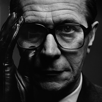
Over the past few weeks, we have been gaining more of an insight to Adobe Photoshop CS4 and how to use it in conjunction with our ancillary tasks. Having already researched the film posters for Tomas Alfredson's 'Tinker Tailor Soldier Spy', I decided to take an image and to edit it in a style that was used for the original film posters. The original poster shows Gary Oldman's character George Smiley constructed from inverted text on a simple black background. There are also many elements of text that are either made bold or written in a different colour to highlight them from the rest, for example, 'WINTER', 'AGENT' and 'THE ENEMY IS WITHIN'. The final quote illustrates possibly how a character from within the British secret service could be the one to betray them all, (foreshadowing). From this, I chose to pick out the key characters from the film and the film title.One problem that I found was that I couldn't make the text stand out enough, given that the text font itself was quite small and in white or red it isn't very visible. To resolve this I laid another layer of text on top and added drop shadows and burn effects.
The only element that I am not entirely pleased with is the titling because it isn't completely visible within the red text against the background, however this does add to the aspect of the spy/espionage genre.
Sunday, 1 July 2012
THE DARK KNIGHT
Totalfilm.com named 'The Dark Knight' 2008 as having the No.1 best movie posters, despite these actually being teaser posters.
So the question is, why were the posters so well received and what made them so popular?
"“Why so serious?” is a brilliant tagline for a start, and the fact that it’s daubed in blood amps up the sense that this is going to be a distinctly adult affair. Plus, we love the tease of showing the Joker without properly revealing his face."
The Joker is such an iconic character that he seems to be the main focus for these posters and even in the first, in which his eyes are drawn onto the wall and the red lips, the lips are actually in the shape of the Batman.
Another effective element is the lack of information conveyed and so the audience is already feeling 'teased' and intrigued into watching the already very famous film franchise. In not revealing the character's actual physical appearances, the plot line and character's real identities or even actors are not revealed.
FILM POSTERS
"Film posters have been used since the earliest public exhibitions of film. They began as outside placards listing the programme of (short) films to be shown inside the hall or movie theater. By the early 1900s, they began to feature illustrations of a scene from each individual film or an array of overlaid images from several scenes. Other film posters have used artistic interpretations of a scene or even the theme of the film, represented in a wide variety of artistic styles."
Beginning in the 1980s, the American film studios began taking over direct production and distribution of their posters from the National Screen Service and the process of making and distributing film posters became decentralised in that country.
Also known as 'Key Art'.
Beginning in the 1980s, the American film studios began taking over direct production and distribution of their posters from the National Screen Service and the process of making and distributing film posters became decentralised in that country.
Also known as 'Key Art'.
So, what is meant by the term 'key art' or a film poster? A poster used to advertise a film; there may be several versions for one film, with variations in regards to size, content and country of production of the poster.
18-year old Mathew Carpenter from Australia established on the 'webdesignerdepot' website that there are 7 elements of a great film poster design:
1. Attention – jump out from the wall.
2. Iconography – showing without telling.
3. Interest – create an incentive to see the film.
4. Appeal – create desire with fans and non-fans alike.
5. Style – a look that’s consistent with the film.
6. Lasting Appeal – a look that suits other formats.
7. Recognisability – if it’s a sequel, make it obvious.
Bill Gold
Artist Bill Gold joined the advertising department of Warner Bros. at 21 and shortly thereafter created the poster for the 1942 classic "Casablanca,". Over the next 60 years, Gold designed or worked with illustrators on about 2,000 motion pictures such as, 'The Clockwork Orange' and 'The Sting'.
Types of film posters
Subscribe to:
Posts (Atom)