
Showing posts with label technology. Show all posts
Showing posts with label technology. Show all posts
Friday, 12 April 2013


Thursday, 28 February 2013
FINAL FILM
Facebook comments:
such a good idea!
that's awesome!
too cute!! :D
this is great - all the hours have paid off!!!!
very well done! does he die at the end? lovely to see your mum, brother and house!
what can i say?!!! that is excellent, well done.
21 likes
YouTube comments:
very good, how long did it take to get the stop motion bit right?
wow! That must have taken hours of work and what a great end result! Your first attempt at film making was a success. The sound track was beautiful and I really enjoyed watching it.
THATS SOO COOOOL!
6 likes

finished dvd cover


dvd design DATED 30THJANUARY
Regarding the design of my DVD cover, obviously it won't be a massively in-depth and heavily designed product because there is no budget for my film and it isn't a large scale film. Having said this however, I am going to design the product to the best of my ability to demonstrate the skills that I have learnt and acquired over the last two years. I am currently undecided on what image I would like on the cover and whether it will be a 'screenshot' (still image from my stop motion) or an external image taken during post-production. On the back of my cover I would like some kind of tagline (similar to the ones used in the images that I have attached in the blog posts below) and then to have a blurb fitted around an image. Below the blurb I intend to have three images from my film in framed boxes with the outer colour being the orange, blue and pink that I have used in my film title.


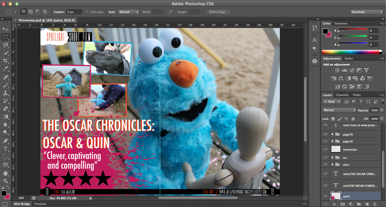
first draft of film review
As our famous
old friend Shakespeare wrote in ‘A Midsummer Nights Dream’ way back in 1598: “Ay me! for aught that I could ever read, Could
ever hear by tale or history, The course
of true love never did run smooth; But either it was different in blood—“,
the challenges new lovers face are as common today as ever before. This is
certainly the case for Oscar and Quin, who feature in The Oscar Chronicles,
created by first-time British director, Nicole O’Malley.
Oscar & Quin, a four minute stop-motion animated short
film follows the story of Oscar, a furry blue character, destined for a gloomy
life in a landfill site. Within
seconds of the film beginning, we’re thrown into the turmoil of discarding
outgrown toys and thrown in the literal sense into the rubbish bin. All is not
lost when Oscar finds true love with Quin, a broken mannequin. Together
they defy the odds and prove that hope is not lost but when faced with a
life-threatening situation, their future becomes compromised.
Created on
a shoestring budget, O’Malley describes her reasoning behind combining stop-motion
and live action in The Oscar Chronicles
“when intertwined with live action, stop-motion brings a timeless quality in a
way that no other medium provides”.
There’s something gratifying about seeing the
animation process in action, the giving of life to inanimate objects, be they
hand-drawn images, computer-generated models or articulated puppets. But
there’s something particularly special about stop-motion animation. It’s not
the process itself, which is painstakingly laborious, but what goes on behind
the scenes.
Set in a rural Norfolk village in contemporary
England, it’s a quirky tale of optimism and romance that compels and captivates
the audience into the first instalment of The Oscar Chronicles.
RELEASED
February 28
DIRECTOR Nicole
O’Malley
RUNNING TIME
4 mins.
Thursday, 14 February 2013
updated poster

Wednesday, 13 February 2013
Monday, 11 February 2013


Wednesday, 6 February 2013
added scene
Upon showing my film to the class, I received really helpful feedback and from this I made the enhancement of adding a flashback scene to mix up the narrative, rather than just being linear.
Rather than focusing on Oscar or Quin this time, I decided to make it more human so that the audience can have an even greater rapport with the characters, and so I filmed my brother opening a present, with Oscar inside. I filmed a variety of shots, closeup, mid-closeups, POV shots but I decided to simply use the one type of shot, rather than a mixture because I felt that within my film I had used a wide variety of shots and by using more than one for the one scene, it seemed to make it a bit disjointed. With regards to editing, I chose to add an effect that would give the clip an aged and vintage look because the rest of my film doesn't really have many effects because it is more driven by the narrative and storyline. I also sped it up slightly so that it didn't last for too long, (because my brother was a little bit slow at opening!!), and also changed the saturation/gamma.
Sunday, 27 January 2013
update
Upon reviewing the opening of my short film, I came to realise that the changes that I made during production meant that the Photoshop images that I had created were no longer relevant and actually detracted from the effectiveness of my film. This was because the 'backstory' that I had created for Oscar no longer fitted and if anything, made the plotline less seamless and quite confusing. For this reason and because I didn't want to put my hard work to waste, I decided to draw out some new images which I hoped would be better. I thought that I would create just two images, rather than five or six, and the first I decided would show Oscar alone in the garden and then to fit with my dog Holly carrying Oscar out later in the film, my dog carrying Oscar in from outside. However, I felt that they didn't really work and I preferred my short film without them.


Regarding my film title.....
Initially, I couldn't find a font that fitted either my genre, style, theme, colour scheme, target audience or anything of that sort so I turned to finding one to download from the Internet and then I came across a font which I layered on top of each other in two colours to make it stand out. :) I chose the colours because the orange matched Oscar's nose; blue for Oscar's fur and the pink was a good contrasting colour to match with. Regarding the actual words in my title... I wanted to create a title that suggested the possibility of it becoming a series of short films following the life of Oscar. To go with this, (similar to Harry Potter and the .....) I chose 'Oscar & Quin' because it is short enough to fit with the length of the full title and it is enough detail to just suggest the characters and plot. Also considering that my film is a silent film, it works well to have the character's names in the title otherwise these would be lost and less of a connection would be made between the characters and audience.
Additional note, I really like the way the blue looks behind the title because it adds a drop shadow making it stand out more but there's actually a relevance behind the colour. (MISE EN SCENE IN ACTION...)

Snoooooooooopy. When preparing to edit my short film, I watched a few episodes of Snoopy to gain an idea of what music was used and how the lack of speech was approached. I then came across a clip on YouTube of Snoopy's wedding (which sadly goes wrong...) which was really helpful because I was worrying about what music to use and it showed me that I could just use a basic song (copyright free, of course) which fitted with my whole film, mixed up with a few others.
Friday, 18 January 2013


Monday, 14 January 2013
Poster design
CHOSEN FILM POSTER IMAGE...

An element that encouraged and pushed me in the direction of a 'silent' film was the inspiration of Snoopy, a fictional character from the comic strip Peanuts, created by Charles M. Schulz. For the first two years of his existence, Snoopy was a silent character until on the 27th May 1952, for the first time, he verbalised his thoughts to the reader in a thought balloon. To begin with, he was a normal dog, only thinking in simple one-word phrases, e.g. "FOOD!", but as the comic strip continued, he became increasinly more articulate. The comic strips and television specials formed a considerable chunk of my childhood and it was this that influenced my decision to remain a 'silent' film. I also didn't want to detract from the themes and meanings of my films by layering on top of the footage, an unrealistic and ill-fitting dialogue.
The hardest decision I've actually had to make, regarding my film poster, is deciding on which fonts I will use for my film poster for both the title and credits. Adobe didn't really have any fonts which I would consider to use and so I have been researching into which fonts fit my film best and which are the easiest for the eye to read. Colours are also very important, I've concluded that the title either has to stand out from the rest of the poster, or to fit with a common colour scheme from my short film.
Monday, 7 January 2013
it's officially over!
FILMING AND EDITING IS DONE.
So, filming took place over a total of two days (Wednesday 2nd January and Saturday 5th January) and editing took 6 hours on Saturday, the whole of yesterday, and the whole of today. The reason that it took so long was because of the stop motion images which not only needed resizing and adjusting the duration, but for a number of them I had to clone stamp using Photoshop to remove the fishing line that was used to raise the mannequin and Oscar.
So, filming took place over a total of two days (Wednesday 2nd January and Saturday 5th January) and editing took 6 hours on Saturday, the whole of yesterday, and the whole of today. The reason that it took so long was because of the stop motion images which not only needed resizing and adjusting the duration, but for a number of them I had to clone stamp using Photoshop to remove the fishing line that was used to raise the mannequin and Oscar.
Shots

WS (Wide Shot) - The subject takes up the full frame, or at least as much as comfortably possible.
i.e. long shot, full shot
MS (Mid Shot) - Shows some part of the subject in more detail while still giving an impression of the whole subject
MCU (Medium Close Up) - Half way between a MS and a CU
CU (Close Up) - A certain feature or part of the subject takes up the whole frame
ECU (Extreme Close Up) - The ECU gets right in and shows extreme detail
Cut-In - Shows some (other) part of the subject in detail
Cut-Away - A shot of something other than the subjectTwo-Shot - A shot of two people, framed similarly to a mid shot
Over-The-Shoulder Shot - Looking from behind a person at the subject
Point-of-View Shot - Shows a view from the subject's perspective
Weather Shot - The subject is the weather. Can be used for other purposes, i.e. background for graphics
Sunday, 23 December 2012
Poster research time
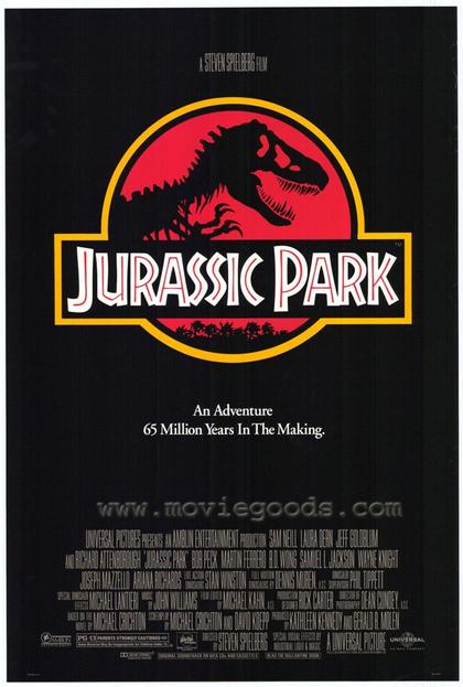


Older film posters typically have quite bold primary colours and the main character's name is featured in a large type, sometimes even larger than the film title because this is what is being promoted. (DR.NO poster is an example of this).
Other posters do not need a great deal of advertisement, actor/character profiling or promotion, or even much indication of plotline. (JURASSIC PARK).
Some posters have a very artistic feel (PERFUME) and feature more editing than other film posters.


My favourite film posters are those made for Totoro and Harry Potter. I particularly love this poster for My Neighbour Totoro because of the colour scheme and its innovativeness.
Harry Potter is my all-time-favourite film franchise and so I love the way that each poster gives a feel of the magic within and the plotline is suggested, along with the characters. I also favour the way that they clearly follow on from one another; i.e. the posters don't radically change in format, style or design and so you can witness the growth of the characters and plot.
I'm currently undecided on what design I will choose for my own short film poster, I think I will take inspirations from both Totoro and The Muppets.
Wednesday, 19 December 2012

Title Sequence Image 2

2nd image....this was surprisingly harder to complete than the first because I didn't think to do all of the images at the same time and so I lost the colours. This meant that I had to find as similar match as possible, using the eyedropper tool worked enough however, because I had used varying opacities, the colours weren't true matches. But, they work nonetheless. Particularly for this one in which the shed can be a darker colour because of the rain :)
Subscribe to:
Posts (Atom)