Showing posts with label film poster. Show all posts
Friday, 12 April 2013
Thursday, 28 February 2013
dvd cover DATED24THFEBRUARY
A few weeks
ago, I decided to send off my ancillary tasks and DVD cover to a professional
printing firm in order to gain multiple hard-copies as this would be the case
for real media texts. The three pieces arrived quickly and I was really happy
with the quality, aside from my film poster being slightly under exposed. I was
incredibly impressed with the quality of my review and DVD cover J yay.
When designing my DVD cover, I
found that the most difficult part was finding images that I hadn’t already
used for my ancillary tasks. This was difficult because being a short film,
there weren’t many production photos or storylines that I could exploit.
I researched into a lot of DVD
covers to find what elements were the most successful, examples that I looked
at were the Toy Story trilogy, a number of Tim Burton films and other age
appropriate films of similar genres.
I decided to include a trio of
images and borders that I also went on to use in my film review, because the
colours form a good colour scheme for my film. J
Certain factors that I spent a
long time on were the duplication of sand, the font of the text on the back and text itself. I deliberated for a long time about the font because I wasn't particularly happy with it yet I discovered that the font used is commonly used on the back of DVD covers; this was also the case with my film review, however, upon receiving my hard-copies, I love the way that they look!
Labels:
adobe,
ancillary task,
dvd case,
dvd cover,
evaluation,
film,
film poster,
film review,
final poster,
finished production work,
magazine,
photoshop,
planning,
post-production,
research,
research and planning
Thursday, 14 February 2013
updated poster
Upon making the initial design for my film review, I have come to think about when the release date of my short film. Originally I dated it as 'January 2013' however, my deadline for the project falls in February and I want my magazine to be in March and so I've reached the decision to change the date, otherwise the audience interprets that my film is slightly old.
Friday, 18 January 2013
Monday, 14 January 2013
Poster design
CHOSEN FILM POSTER IMAGE...
Regarding my film poster design, I am choosing not to use an overly-edited or actor-driven style. Firstly, I couldn't really make it very actor-driven because of the lack of cast within my short film, being that there is actually only one human role. And I feel that using an edited image would detract from the style, genre and theme of my short film which relies on the characters to drive the plot and it is fairly simplistic, following the concept that I am not using an dialogue, only non-diagetic music and sound. An element that encouraged and pushed me in the direction of a 'silent' film was the inspiration of Snoopy, a fictional character from the comic strip Peanuts, created by Charles M. Schulz. For the first two years of his existence, Snoopy was a silent character until on the 27th May 1952, for the first time, he verbalised his thoughts to the reader in a thought balloon. To begin with, he was a normal dog, only thinking in simple one-word phrases, e.g. "FOOD!", but as the comic strip continued, he became increasinly more articulate. The comic strips and television specials formed a considerable chunk of my childhood and it was this that influenced my decision to remain a 'silent' film. I also didn't want to detract from the themes and meanings of my films by layering on top of the footage, an unrealistic and ill-fitting dialogue.
The hardest decision I've actually had to make, regarding my film poster, is deciding on which fonts I will use for my film poster for both the title and credits. Adobe didn't really have any fonts which I would consider to use and so I have been researching into which fonts fit my film best and which are the easiest for the eye to read. Colours are also very important, I've concluded that the title either has to stand out from the rest of the poster, or to fit with a common colour scheme from my short film.
Sunday, 23 December 2012
Poster research time
Film posters all have a very different appearance and reception based upon the genre and target audience of the film.
Older film posters typically have quite bold primary colours and the main character's name is featured in a large type, sometimes even larger than the film title because this is what is being promoted. (DR.NO poster is an example of this).
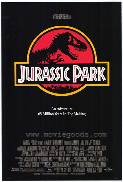
Other posters do not need a great deal of advertisement, actor/character profiling or promotion, or even much indication of plotline. (JURASSIC PARK).
Some posters have a very artistic feel (PERFUME) and feature more editing than other film posters.

My favourite film posters are those made for Totoro and Harry Potter. I particularly love this poster for My Neighbour Totoro because of the colour scheme and its innovativeness.
Harry Potter is my all-time-favourite film franchise and so I love the way that each poster gives a feel of the magic within and the plotline is suggested, along with the characters. I also favour the way that they clearly follow on from one another; i.e. the posters don't radically change in format, style or design and so you can witness the growth of the characters and plot.
I'm currently undecided on what design I will choose for my own short film poster, I think I will take inspirations from both Totoro and The Muppets.
Older film posters typically have quite bold primary colours and the main character's name is featured in a large type, sometimes even larger than the film title because this is what is being promoted. (DR.NO poster is an example of this).
Other posters do not need a great deal of advertisement, actor/character profiling or promotion, or even much indication of plotline. (JURASSIC PARK).
Some posters have a very artistic feel (PERFUME) and feature more editing than other film posters.

My favourite film posters are those made for Totoro and Harry Potter. I particularly love this poster for My Neighbour Totoro because of the colour scheme and its innovativeness.
Harry Potter is my all-time-favourite film franchise and so I love the way that each poster gives a feel of the magic within and the plotline is suggested, along with the characters. I also favour the way that they clearly follow on from one another; i.e. the posters don't radically change in format, style or design and so you can witness the growth of the characters and plot.
I'm currently undecided on what design I will choose for my own short film poster, I think I will take inspirations from both Totoro and The Muppets.
Wednesday, 28 November 2012
Update
Seeing as I am currently unable to film because of the foul (rainy and soggy) weather, I have recently been thinking about other tasks that have to be completed such as my film poster and review. Thinking about my film poster led me to photograph my puppet and mannequin just to gauge some ideas on what I want my poster to look like and feature. One idea that I particularly like is having a landscape image with the face of my puppet on the bottom. This was inspired by the film poster for 'Submarine' (a Richard Ayoade film) and I also found some character posters for 'The Muppets' which showed Kermit, Miss Piggy, Animal, etc. in a similar position except on a portrait poster. Finding this was very helpful because I was slightly worried about creating a film poster that didn't include any human characters. I am currently undecided whether my brother Jacob will be a part of the film poster or not.
Another task that I have been thinking about is my opening title sequence for my short film. I want to make it quite a fun and animated sequence that will not only feature titles including director, producer, costumer designer, props and cast, etc. but also an animation of the puppet's prior life in which he was alone and living in a dirty/uninhabitable place until he is found by Jacob and they become friends. I have watched a few YouTube videos of other students who have created their own animated title sequence that fits with the kind of theme/genre of my short film. I want the sequence to either end with a blend from the animation to the real footage or a scribble into the footage.
HOW I WILL DO THIS I HAVE NO IDEA. WHY OH WHY MUST I COME UP WITH DIFFICULT IDEAS?!
The inspiration came from finding the original drawings of my puppet and I thought that it would be a nice idea!
I also want to create a 'fun' production company rather than the simple one I made at AS.
I have been considering the idea of using a flick book to stem the animation from. I could either create an animated flick book of pages with nothing on which progresses into being the pages upon which the animation is on or I could film a flick book.
Another task that I have been thinking about is my opening title sequence for my short film. I want to make it quite a fun and animated sequence that will not only feature titles including director, producer, costumer designer, props and cast, etc. but also an animation of the puppet's prior life in which he was alone and living in a dirty/uninhabitable place until he is found by Jacob and they become friends. I have watched a few YouTube videos of other students who have created their own animated title sequence that fits with the kind of theme/genre of my short film. I want the sequence to either end with a blend from the animation to the real footage or a scribble into the footage.
HOW I WILL DO THIS I HAVE NO IDEA. WHY OH WHY MUST I COME UP WITH DIFFICULT IDEAS?!
The inspiration came from finding the original drawings of my puppet and I thought that it would be a nice idea!
I also want to create a 'fun' production company rather than the simple one I made at AS.
I have been considering the idea of using a flick book to stem the animation from. I could either create an animated flick book of pages with nothing on which progresses into being the pages upon which the animation is on or I could film a flick book.
Monday, 26 November 2012
Wednesday, 21 November 2012
Magazine practice
On Friday, I went to go and see Twilight: Breaking Dawn Part 2 and I loved the way that Bella Swan looked as a vampire, particularly with the heavy pigmentation of her eye make-up. For this reason, I thought it would be a great practice for a magazine poster and this led me to think of this possible title. It seems relevant because the term in filmmaking refers is a technique in which a series of short shots are edited into a sequence to condense space, time, and information; this seems to fit with what a film magazine is all about.
The great thing about this image is the colour of Bella's eye - it allowed me to have a play around to change the colours of it to purple, blue, etc. which gave the image a completely different feel.
Monday, 16 July 2012
RESPONSE TO 'TINKER TAILOR SOLDIER SPY'

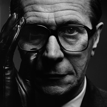
Over the past few weeks, we have been gaining more of an insight to Adobe Photoshop CS4 and how to use it in conjunction with our ancillary tasks. Having already researched the film posters for Tomas Alfredson's 'Tinker Tailor Soldier Spy', I decided to take an image and to edit it in a style that was used for the original film posters. The original poster shows Gary Oldman's character George Smiley constructed from inverted text on a simple black background. There are also many elements of text that are either made bold or written in a different colour to highlight them from the rest, for example, 'WINTER', 'AGENT' and 'THE ENEMY IS WITHIN'. The final quote illustrates possibly how a character from within the British secret service could be the one to betray them all, (foreshadowing). From this, I chose to pick out the key characters from the film and the film title.One problem that I found was that I couldn't make the text stand out enough, given that the text font itself was quite small and in white or red it isn't very visible. To resolve this I laid another layer of text on top and added drop shadows and burn effects.
The only element that I am not entirely pleased with is the titling because it isn't completely visible within the red text against the background, however this does add to the aspect of the spy/espionage genre.
Sunday, 1 July 2012
TINKER TAILOR SOLDIER SPY


Tinker Tailor Soldier Spy is a 2011 Anglo-French espionage film directed by Tomas Alfredson, from a screenplay written by Bridget O'Connor and Peter Straughan based on the 1974 novel Tinker, Tailor, Soldier, Spy by John le CarrĂ©. The film stars Gary Oldman as George Smiley, and co-stars Colin Firth, Tom Hardy, John Hurt, Toby Jones, Mark Strong, Benedict Cumberbatch and CiarĂ¡n Hinds. It is set in London in the early 1970s and follows the hunt for a Soviet double agent at the top of the British secret service.
Prior to the film's release, a number of teaser character posters were released that featured stars including Gary Oldman, Benedict Cumberbatch and Colin Firth. It is clear that the main actor being promoted to an audience because even on the character posters his name is featured in a larger type above the title of the film.
I particularly like these posters because the design of the numbers and character faces is very effective and conveys that the film will involve spies/espionage and of a detailed nature.
The official film poster features stills from the film of the key characters and also anecdotes from the likes of 'EMPIRE'. I personally don't think that this poster is as effective as the character posters because it reveals a great deal and I believe that with the genre 'spy fiction', not many details should be revealed aside from actors, title and date because it detracts from the professionalism of the poster. The key actors within the film are also very well known within the industry and to the public and so it is not quite necessary to promote the film with such high budgeting and anecdotes.
When looking at the 1979 TV mini-series of 'Tinker Tailor Soldier Spy', it is very easy, putting technological advances aside, to define the differences and similarities between the two. The 1979 version adopts a cartoonistic approach which depicts the character of George Smiley and a number of metaphorical symbols such as the broken statues and running figure. Also, a tagline is used to sum up the film/tv series; I don't think this is particularly effective however, it may be a fairly traditional convention of the time when introducing new plot lines. A strong similarity between the two versions is the strong use of the male protagonist within the poster.
THE DARK KNIGHT
Totalfilm.com named 'The Dark Knight' 2008 as having the No.1 best movie posters, despite these actually being teaser posters.
So the question is, why were the posters so well received and what made them so popular?
"“Why so serious?” is a brilliant tagline for a start, and the fact that it’s daubed in blood amps up the sense that this is going to be a distinctly adult affair. Plus, we love the tease of showing the Joker without properly revealing his face."
The Joker is such an iconic character that he seems to be the main focus for these posters and even in the first, in which his eyes are drawn onto the wall and the red lips, the lips are actually in the shape of the Batman.
Another effective element is the lack of information conveyed and so the audience is already feeling 'teased' and intrigued into watching the already very famous film franchise. In not revealing the character's actual physical appearances, the plot line and character's real identities or even actors are not revealed.
Subscribe to:
Posts (Atom)