Here is my final film, I released it on YouTube on February 3rd and since then it has received 186 views to date, a number of comments and 6 likes. I am incredibly happy with the response because it included a wide range of ages and a lot of people had something positive or constructive to say. :) Facebook comments: such a good idea! that's awesome! too cute!! :D this is great - all the hours have paid off!!!! very well done! does he die at the end? lovely to see your mum, brother and house! what can i say?!!! that is excellent, well done. 21 likes YouTube comments: very good, how long did it take to get the stop motion bit right? wow! That must have taken hours of work and what a great end result! Your first attempt at film making was a success. The sound track was beautiful and I really enjoyed watching it. THATS SOO COOOOL! 6 likes
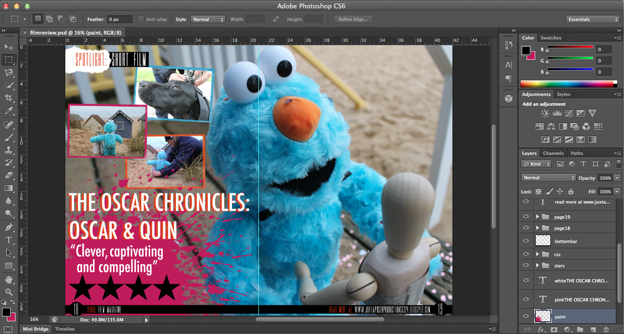
Here is my finished film review, I am really pleased with it! I made a number of changes during the production process because I found that having the background image fully visible made it difficult to both view the text and also to find a text colour that was visible on all areas. For this reason, I changed the hue and exposure to tone down the image and to give it more of a washed-out effect. This meant that I could use simple black text on top (I actually layered it twice to make it more visible) and the orange type was also clear. I decided to put my blog site on the bottom trimming because I found that a lot of magazines either had links to the magazine's site or the film's individual site. It also provides a nice 'link' (excuse the pun) to my production company - Juxtaposed Productions. When creating my review, I found that a number of people asked me why I rated my film as '4 stars', not because they thought it was too high but because they thought it should be rated '5 stars'. The reasoning behind this was because I didn't want to come across as pretentious and also, '5 star' ratings are fairly 'rare' so to speak and for a film to be of such a good quality, I feel as though it should be perfect.
A few weeks
ago, I decided to send off my ancillary tasks and DVD cover to a professional
printing firm in order to gain multiple hard-copies as this would be the case
for real media texts. The three pieces arrived quickly and I was really happy
with the quality, aside from my film poster being slightly under exposed. I was
incredibly impressed with the quality of my review and DVD cover J yay.
When designing my DVD cover, I
found that the most difficult part was finding images that I hadn’t already
used for my ancillary tasks. This was difficult because being a short film,
there weren’t many production photos or storylines that I could exploit.
I researched into a lot of DVD
covers to find what elements were the most successful, examples that I looked
at were the Toy Story trilogy, a number of Tim Burton films and other age
appropriate films of similar genres.
I decided to include a trio of
images and borders that I also went on to use in my film review, because the
colours form a good colour scheme for my film. J
Certain factors that I spent a
long time on were the duplication of sand, the font of the text on the back and text itself. I deliberated for a long time about the font because I wasn't particularly happy with it yet I discovered that the font used is commonly used on the back of DVD covers; this was also the case with my film review, however, upon receiving my hard-copies, I love the way that they look!
Prior to designing, writing and creating my film magazine review, I researched into existing film magazines and the kind of articles that they include.
Empire Magazine is a British film magazine published on a monthly basis by Bauer Consumer Mediam, first published in July 1989. It is the biggest selling film magazine in Britain and is also sold in America, Australia, Turkey, Russia and Portugal. In terms of coverage and approach, Empire is very popular and takes on a more 'irreverent' and less 'serious' approachre, like Sight & Sound. Empire caters for a wide audience as it reviews not only mainstream films, but also arthouse.
Similar to Empire, Sight & Sound is published on a monthly basis in Britain by the British Film Institute (BFI). It was initially published quarterly when it began in 1932, until the early 1990s when it merged with the Monthly Film Bulletin, another BFI publication. Sight & Sound reviews all films released during the month - both arthouse and mainstrean feature films.
Total Film is British film magazine published by Future Publishing every four weeks, 13 times a year. Its original launch was in 1997 and offers cinema, DVD and Blu-ray news, reviews and features. 'Each month, Total Film provides a range of features, from spotlight interviews with actors and directors, to making of and on-set pieces for new and future releases. Each issue always includes the Total Film Interview, which is a six-page in-depth chat with an actor or director, along with a critique of their body of work.'
When creating my film review, I constantly kept in the back of my mind that my film was a short and so if it were to be reviewed in a magazine then it would have to be a 'special occasion'. This was why I decided to make my insert a 'Spotlight' and so it was enabling the reader to witness, read about and potentially watch a short film. Empire Magazine don't really tend to do this kind of thing so initially this cast doubt in my mind, however, Total Film really encouraged me to do it because they often provide 'spotlight interviews' :).
Upon making the initial design for my film review, I have come to think about when the release date of my short film. Originally I dated it as 'January 2013' however, my deadline for the project falls in February and I want my magazine to be in March and so I've reached the decision to change the date, otherwise the audience interprets that my film is slightly old.
Upon showing my film to the class, I received really helpful feedback and from this I made the enhancement of adding a flashback scene to mix up the narrative, rather than just being linear.
Rather than focusing on Oscar or Quin this time, I decided to make it more human so that the audience can have an even greater rapport with the characters, and so I filmed my brother opening a present, with Oscar inside. I filmed a variety of shots, closeup, mid-closeups, POV shots but I decided to simply use the one type of shot, rather than a mixture because I felt that within my film I had used a wide variety of shots and by using more than one for the one scene, it seemed to make it a bit disjointed. With regards to editing, I chose to add an effect that would give the clip an aged and vintage look because the rest of my film doesn't really have many effects because it is more driven by the narrative and storyline. I also sped it up slightly so that it didn't last for too long, (because my brother was a little bit slow at opening!!), and also changed the saturation/gamma.
Upon reviewing the opening of my short film, I came to realise that the changes that I made during production meant that the Photoshop images that I had created were no longer relevant and actually detracted from the effectiveness of my film. This was because the 'backstory' that I had created for Oscar no longer fitted and if anything, made the plotline less seamless and quite confusing. For this reason and because I didn't want to put my hard work to waste, I decided to draw out some new images which I hoped would be better. I thought that I would create just two images, rather than five or six, and the first I decided would show Oscar alone in the garden and then to fit with my dog Holly carrying Oscar out later in the film, my dog carrying Oscar in from outside. However, I felt that they didn't really work and I preferred my short film without them.
Regarding my film title.....
Initially, I couldn't find a font that fitted either my genre, style, theme, colour scheme, target audience or anything of that sort so I turned to finding one to download from the Internet and then I came across a font which I layered on top of each other in two colours to make it stand out. :) I chose the colours because the orange matched Oscar's nose; blue for Oscar's fur and the pink was a good contrasting colour to match with. Regarding the actual words in my title... I wanted to create a title that suggested the possibility of it becoming a series of short films following the life of Oscar. To go with this, (similar to Harry Potter and the .....) I chose 'Oscar & Quin' because it is short enough to fit with the length of the full title and it is enough detail to just suggest the characters and plot. Also considering that my film is a silent film, it works well to have the character's names in the title otherwise these would be lost and less of a connection would be made between the characters and audience.
Additional note, I really like the way the blue looks behind the title because it adds a drop shadow making it stand out more but there's actually a relevance behind the colour. (MISE EN SCENE IN ACTION...)
Snoooooooooopy. When preparing to edit my short film, I watched a few episodes of Snoopy to gain an idea of what music was used and how the lack of speech was approached. I then came across a clip on YouTube of Snoopy's wedding (which sadly goes wrong...) which was really helpful because I was worrying about what music to use and it showed me that I could just use a basic song (copyright free, of course) which fitted with my whole film, mixed up with a few others.
As you will be aware from my initial plotline and ideas, I was planning to film the wedding, and probably the majority of my short film, outside in the snow. We had a small amount of snow (a slight icy frosting) at the beginning of December but it didn't really have the 'look' that I wanted so I waited in the hope that we'd suddenly have a mass of snow either before or after Christmas. Funnily enough, we have had plenty of snow over the past week - typically though, the snow fell a week after I had completed all of the filming and editing for my product. I thought I should take advantage of the snow and to just take some photos demonstrating why snow isn't the easiest to work with.
When I first placed the mannequin in the snow , it fell straight over (See below images), this seemed to be some kind of sign that attempting to film in this environment wasn't really going to work.
Problems: -
Lighting - the snow has a set sort of feel/ambience and there's not much that can be done regarding lighting.
Focus - despite being good in other circumstances, my camera initially struggled to focus with regard to the brightness of the snow.
Lack of continuity - unlike sand which can be moved quite easily, the snow is quite crisp and leaves imprints which are too large. Therefore uneffective in stop motion.
Practical reasons - snow gets dirty, the characters get wet and it's quite unpredictable in terms of melting, or snowing more.
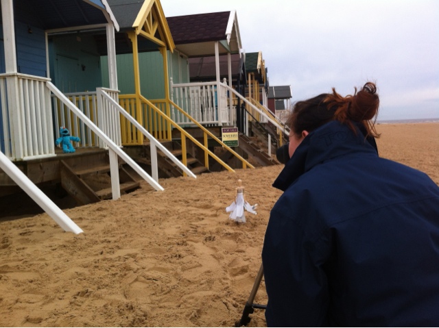
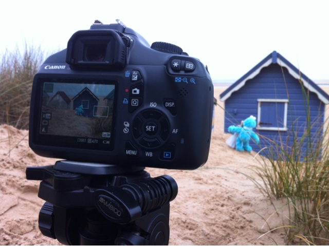
Okay so I intended to post a video yesterday of me talking about updates since filming and what changed during the production process. And A LOT changed. Firstly, I decided to take a trip to the beach to film the wedding and it was there that I chose to film more scenes than I had initially intended to. I feel that this was a great decision to make because it gave my film a great deal more depth. Although, there were actually a lot of consequences for choosing the beach which I didn't really consider or think would happen. The first was other people, being a public attraction, obviously there were tourists who I had to work hard to try and not include within my film. Secondly, sand. Never work on a sandy surface! It moves and is incredibly difficult when doing stop motion because it isn't really until afterwards that you are able to see where the imprints on the sand were left. Despite some imperfections, I am very happy with how the scenes turned out. Because I was so happy with the location of the beach, I decided to create an additional ending scene to utilise the lovely scenery and also an ending which is fun but also posing another idea. I hadn't really thought of a solid finish an so I feel as though this was a very effective choice :) Regarding the garden scenes, even more changed, for the better I hasten to add! Changing of scenes: 1. Having my mum packing old toys into a box to add a human element to the short film and also depth and history behind the characters. 2. Using a GoPro Hero camera attached to my dog's head to film her carrying Oscar outside. 3. My dog dropping Oscar on to the floor near the bin. 4. Having a stop motion sequence of Oscar and the mannequin meeting. So as you can see, I actually changed most of my film during the production process. Editing is my favourite process so I didn't really have too many problems with this. Although I did experience a few issues and delays because the stop motion images needed resizing for they were too large and I had to set the time for which they would be shown. I also had to use Colour Correction on the scenes filmed using the GoPro Hero camera because they were quite saturated and pale. These scenes were: my dog carrying out Oscar with the camera attached to her head!!! And the opening of the bin from inside. I like these two scenes because they are not only different but also when filming other parts (which I didn't end up using), it was very helpful to learn about multi-camera filming and editing:) I just need to sort out my music and titling. Yay.